This evening I noticed an icon I didn’t recognize in my Chrome browser where my StumbleUpon button normally was. Turns out this eyesore is the new official StumbleUpon logo.
Seriously.
Stumbling Around the Web
For those of you who don’t know, StumbleUpon is a fabulous social media sharing site. Their Stumble tool bar is a great way to browse around the web and find new thing online based on your interests.
As you go you can give pages either a thumbs up or a thumbs down. Because it is interest driven people tend to see content they like. Plus they have some sort of learning algorithm so that it tends to show you more stuff that is similar to your likes and less of the stuff you don’t like.
You can also share websites directly with other Stumblers you are connected with, plus a whole bunch of other things.
StumbleUpon has been one of the big traffic sources to my websites over the years.
StumbleUpon Logo Horror
Up until yesterday StumbleUpon had one of the best logos in the whole social media world. I happen to like teal and green. The SU logo flowed from one side of the logo to the other like their service helps you flow through the web.
Here’s what they said about the redesign on their blog:
StumbleUpon Logo Change – We know this is a big change, and many of you (like us) had come to love our old blue and green logo. However, as we spoke with our members during our redesign process, we heard our old logo didn’t capture the true experience you had with StumbleUpon – the excitement you feel with every Stumble and the adventure that we take you on. (And just in case you were wondering, we didn’t change it because some users saw a similarity between our logo and Cascade Complete dishwasher packets, although the likeness is uncanny!) While our old logo will be missed, we have also heard from many of you who really like the new logo and feel that it represents what StumbleUpon is to you. We hope that you will come to love it as much as we do here. Plus it’s going to look GREAT on T-shirts and swag – stay tuned!
So. Let me get this right. The old logo “didn’t capture the true experience” with StumbleUpon. But this new orange eyesore somehow does?
It looks like a clogged pipe! Their marketing folks need some Drano. Talk about a focus group going horribly wrong!

I have no idea how many people are the “many” they heard from. But I find it incredibly hard to believe that most people would choose the new logo over the old one.
Full Website Redesign
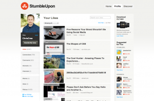
The logo destruction is part of a grand redesign of the StumbleUpon website. I think I get what they are going for.
Seems like they want to make StumbleUpon as much the same as other social sites as they can. They’ve change their “Favorites” to “Likes” because, well, that’s what Facebook does.

They went with a white & gray motif, with a touch of orange and blue for highlight colors – reminiscent of Google+
At the end of the day I suspect this is a move to try to increase engagement on the website itself. Something tells me most folks use the toolbar nearly to the exclusion of the website.
Honestly I don’t begrudge them any of the changes to the site. I do miss the old ability we had (before their previous website redesign) where we users could customize our profile pages. But hey, the trend in social media sites today is away from personalization of user profiles and towards sterile sameness.
But the logo?!! What ever were they thinking?
Update: In the Mac App Store the iPad/iPhone customer reviews are running about 26 to 3 against the new logo with many folks clamoring to bring back the old logo.

