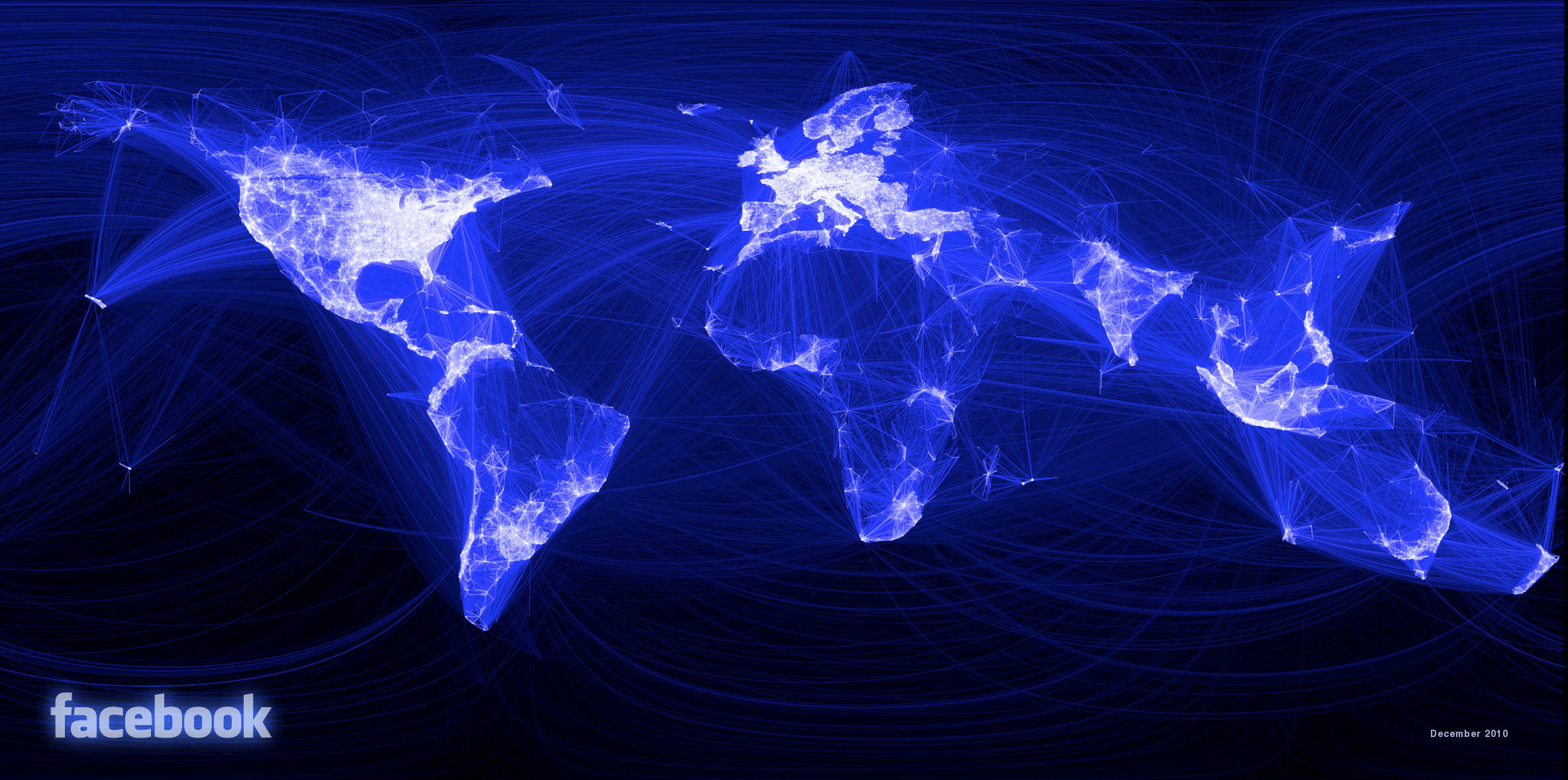
An intern in Facebook’s data engineering department has created a striking image of our connected world by mapping lines visualizing facebook connections between cities in the world.
Paul Butler plotted out lines of Facebook connections using the Latitude and Longitude of the cities for each end of the lines. The result is a pretty striking partial map of the world with the most “connected” portions showing lighter and the less connected parts of the world are darker.
The result is an interesting representation of the world. With over half a billion people using the website it seem to me to be a decent generalization of where the internet connections are in the world.
It’s a good reminder how many people that we can reach for our businesses. The key is to have a dynamic Facebook page to attract people to your business and your main business website. (If you need a more interactive page there is nothing easier to use than Lujure.)
Dark Areas
 The light parts of the image are an impressive reminder of how connected our world is becoming.
However the thing that jumped out at me is how much of the world is still so very dark yet. Just take a look at this complete map here. There are huge areas in Africa, South America and Asia that are still pretty dark yet.
My first thought is that there are probably not very many people in those places. And there’s is some truth to that.
So I pulled out an image that I found a while back that shows a composite map of the world ground lights at night. There are some interesting differences in the two maps. Some areas that have power enough for lights at night are still not on Facebook yet, most notably China.
I guess you could say that even the second largest website in the world still has lots of room for growth. Since that’s the case, then there’s surely plenty of room for your website audience to grow too!


