
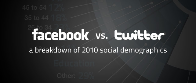
Today I wanted to share with you an informative infographic put together by DigitalSurgeons.com comparing demographic data between Facebook and Twitter. I found some surprises here.
For example, even though Facebook is just about 5 times the size of Twitter, the first surprise for me is how similar their demographics really are. There are differences, but they are more a matter of degrees than outright contrasts.
It surprises me that Twitter skews a little older than Facebook. If your target market is over 30 years old then there is a higher percentage of them to reach on Twitter.
The income distribution was a little flatter on Twitter than on Facebook. Facebook users are more concentrated more in the middle of the income spectrum whereas Twitter has more at either end.
So what numbers in this infographic jump out at you?
